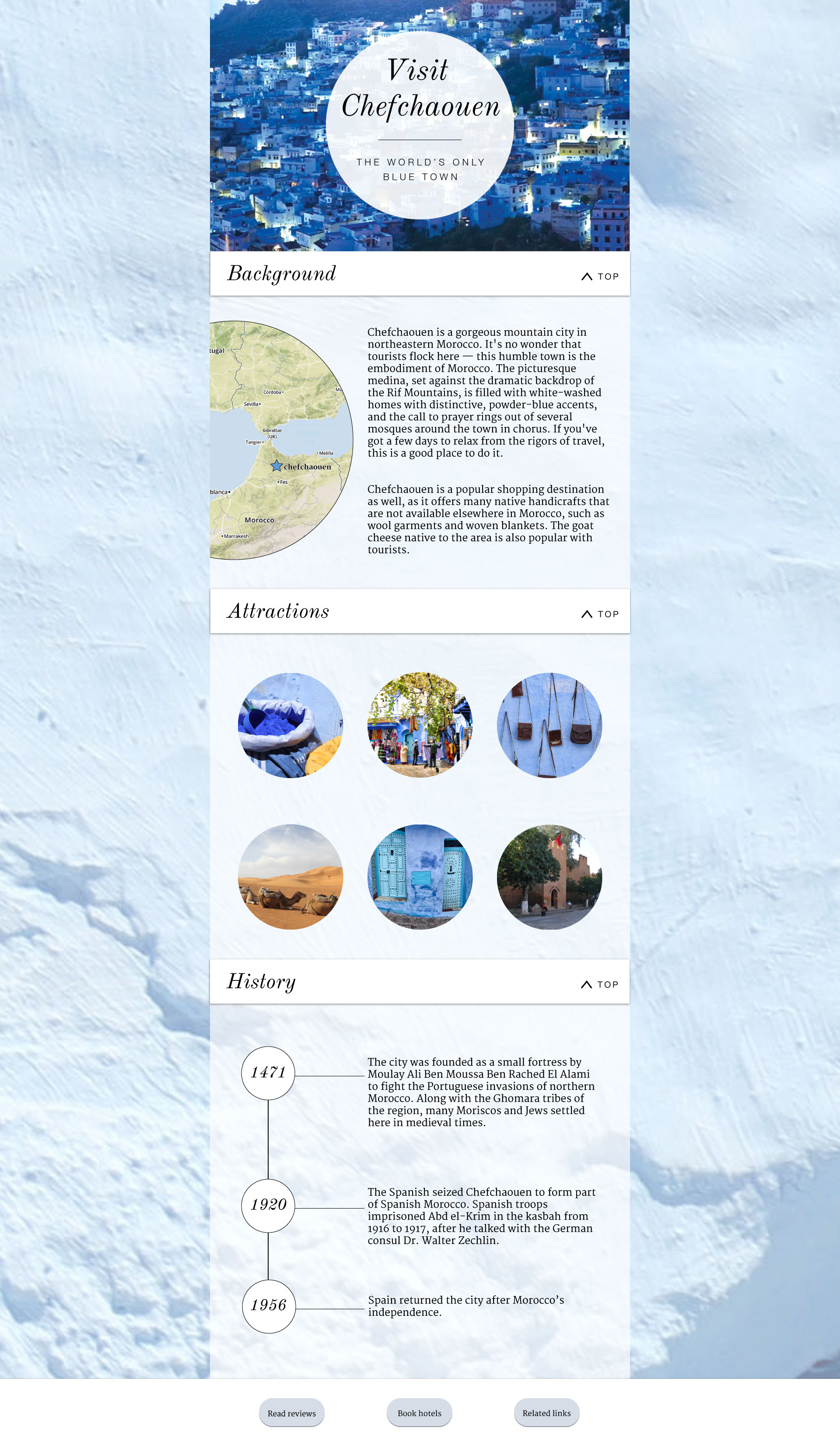
I took the advice from the critique, and revised my body typeface choice (still a serif, but I've chosen Merriweather, and lost the italics). I wanted to stay with the aesthetics of the circle -- as I looked over my previous design, I noticed that I was mixing the circular shape with the rectangular. But now I worry if I've gone too far with it. For the "attractions" part of the page, I will have the hover states (or "tap" states for mobile devices) give more information. I've also revised my choice of timeline, as suggested by my peers.

